7 Reasons you need a landing page

Think of a landing page as a pop-up shop on the high street.
Just as a website or ecommerce homepage is the equivalent of a storefront, the landing page is like a temporary stall in a farmers’ market.
But while a pop-up shop can be found in a street or market; a landing page is accessed through a link, click-through ad or social media.
What exactly are landing pages and why do you need one?
Typically, a landing page contains a form that a visitor fills out in order to access an offer, such as a free download. The page is designed to convert the visitor into a lead or even directly into a customer.
Nowadays, far more people access the internet through a mobile device or smart phone than a desktop computer. And in many ways, websites have been superseded. As a business owner, you can’t sit back and rely solely website traffic anymore.
People on their smart phones or tablets are flicking through their notifications and updates or checking their newsfeeds in their apps. They’re scrolling through Facebook, Twitter and Instagram.
Place a link to your landing page on social media or somewhere else on the internet with lots of traffic, and prospects will be drawn to your offer.
Seven reasons to build a landing page
Let’s take a closer look at why landing pages are so essential to your online business and why you can’t afford to ignore them.
They get to the point. And fast.
People are busy. They want to find what they need as quickly as possible. They don’t want to traipse around the shops. They want to get what they came for and then be on their way.
Landing pages are very specific and have limited options. Visitors are given the choice of signing up for your offer or leaving the page.
They’re simple and uncomplicated
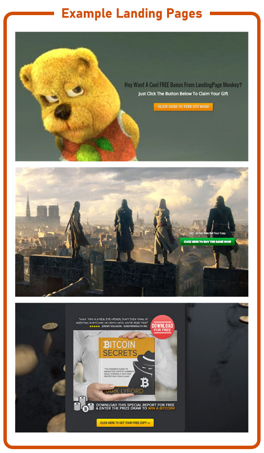
The landing page presents a clear, simple message. A good landing page presents one headline, one call-to-action (CTA) and an image. It takes away the confusion. Visitors are presented with two choices – leave their details or leave the page.
Research by Adobe has shown that landing pages typically see a 25% increase in conversion.
The idea is that the visitor ‘pays’ for your amazing offer (a free ebook / webinar / online course) by handing over their email address.
You’re in the driving seat
Landing pages allow you to control your traffic. By collecting email addresses you’ll have plenty of opportunities to win a sale further down the line. You’re not compelled to win the sale immediately.
Plus, it’s easy to track the data from landing pages to analyse which of your marketing efforts work best. You can easily see how long someone stays on the page, the bounce rate and the number of leads generated.
Learn to do the splits
Another beauty of the landing page is its flexibility. Without tying yourself in knots, you can easily split-test pages to see which converts the quickest.
Split testing, also known as A/B testing, allows you to compare two different versions of a page to see which performs better. By tweaking the headline, the image, or the CTA, you’ll be able to see which version brings in more leads.
You can also play around with how many form fields to use. Should you use four: name, email address, phone number, home address? or just two: name and email address?
You can design landing pages with all of these variables and more, then pick the one that works best.
They blend in with your other marketing strategies
Life’s full of tough choices.
Cat or dog? Apple or Windows? Electric or gas-powered car?
Luckily, landing pages are a decision you won’t need to struggle with. They easily fit in with your existing marketing tools, including PPC or social media advertising.
It goes without saying though that to harvest the best leads you need to ensure you’re advertising in the right places.
Think carefully about your target audience. Do they favour Twitter or Pinterest? What type of content will they engage with?
By designing custom landing pages for social media ads, you provide information that is relevant to your ad — and your audience — alone. This keeps social media landing pages concise.
It’s also essential to think about the type of content you’re providing. Is it well-written and share-worthy? This is the best way to increase your followers.
It’s easy to see if your investment is paying off
Landing pages with a single message are easy to measure. Various marketing analytics mean you can track your return on investment (ROI) to see how well your pages convert visitors to leads and customers.
You can start by looking at your CTA. If you’re not getting a good enough click-through rate, it could be because the copy is confusing, out of context or isn’t noticeable enough.
Can your visitor figure out what to do on the page within a few seconds? That’s the amount of time they’ll hang about before either following the CTA or clicking away again.
They’re great on the go
Landing pages are ideal for smart phones and tablets, though there are a few points to bear in mind. You need to optimise your landing pages for mobile use. This means short, sharp messages with straightforward instructions.
There’s very little space to get your offer across on a mobile screen – around six inches or less. The fewer the words, the more impact they’ll have. Make each word pay.
You also need to address your customer’s pain point from the get-go and make your offer in lightening quick time.
See how you can reap the benefits
Businesses everywhere can benefit from well-designed landing pages. They’re an incredibly easy tool to turn visitors into leads and customers.
Landing pages with simple messages garner the best results. In fact, they’re one of the fastest ways to grow your business.
Why not put it to the test yourself? See how your business could grow by designing your own landing pages and tracking the results.
